Art 4 N00bz: Elements of Art
introduction
i get asked sometimes about my process and how i plan out my pieces, so i thought a long post about the basic principles of art would be helpful. this information can be used twofold as both a way to compose new art AND critique existing art.
building your art "vocabulary" will allow you to break down pieces of an existing image into more digestible points. you might look at a piece and go 'that's neat', but with these words as tools, you can better separate the strongest and weakest part of a given piece. this includes your own artwork, too, and it can really encourage you to improve, speaking from personal experience.
the vocabulary might seem like a lot, but i found it personally pretty intuitive. and honestly, you don't need to memorize them. you can always just memorize a couple that you want to focus on or remember especially and then branch out from there. that's how i learned to play mahjong, and that's how i learned to really understand art, too.
as a disclaimer: i did take some classes on art in college. these included the basics of art, figure drawing, perspective, and history. that said, the information i took in during this time is dwarfed by the amount i studied on my own. i am majorly self taught. YOU CAN DO THIS TOO! INFORMATION IS FREE!
and remember that you are drawing for yourself first and foremost. if you forget that, you may find yourself pressured to draw in ways that aren't natural to you, and you might punish yourself for it. but REMEMBER. art is meant to serve YOU. if other people like it, that's a bonus, of course, but remember that art is an ancient tool of self-expression. don't force it, don't get scared of what other people will think of it, just worry about whether YOU like it. ok? have fun. that's all!
the elements of art
these are the building blocks of art critique. i often use the wikipedia page if i forget them.
here, i will be visually portraying them for ease of reference.
line
this refers to literal or implied lines in a piece, whether through movement, direction, or contour, and similar. they might help guide the viewer's eye, or frame the piece, or ascribe some type of tension or balance. lines are really versatile!
i used many lines in this piece.
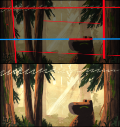
the top of the capybara's head is so flat that it serves to guide an invisible line across the piece. the trees on either side help anchor the viewer, placed in perfect balance along the capybara head line. the piece further split in three sections through the background foliage, defining a fore, mid, and background.
the squiggly line on top helps the viewer return back to the center of the piece. imagine it as a sort of path or guideline to follow when the viewer gets a little lost looking at the details.
shape
you know shapes from your kindergarten class. you might say that you like the use of shape in a piece if the artist makes prominent use of a shape to imply a feeling, like a halo would be a very light airy circle, or a rectangle might be used to make the piece feel grounded or stable.
a cheat sheet for what shapes tend to be used for:
- square, rectangle: stability, sturdiness, containment, density, rigidity
- triangle: sharpness, gentle slope, disarray, hostility, clarity, direction
- circle: safety, protection, smoothness, undisturbed tranquility, hollowness, something that holds
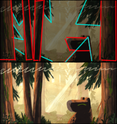
in this piece, i used a lot of rectangles and triangles. i used the triangles as a way to both guide the eye and imply a gentle slope. the rectangles are planted firmly in the foreground, and the way they are set on either side imply a very "stable" (and safe) frame. the capybara's square head defines its sturdy mass, connected by a triangle that slopes outward for stability.
form
form refers to the 3d volume of a thing. spheres, pyramids, cubes, etc. "implied form" is a term i often use with organic shapes (stuff you find in nature, like the way your arms are shaped) being defined in a 2d space, especially using shading, hatch-marks, and other features that accentuate a curve you wouldn't normally see.
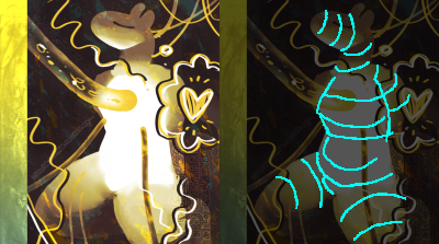
this is a piece i drew called chrysalis.
using my outlines here, i define what the 'implied form' is here. the curved lines help visualize where the light is falling on the body, and how it reflects ambient light.
tangentially (but helpfully), in my figure drawing class, an important skill i learned was "feeling out" the depth of an object. i use this a lot to create form in my artwork. it is also known as the "coil method".
the video i saw passed around on social media some time ago (wow, 11 years? time flies!) still holds up today!
the more you use coil method, the easier it will be to 'feel out' form, both in your own artwork and when drawing over other's (AS REFERENCE!).
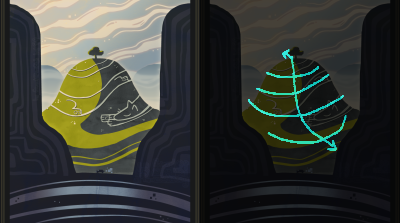
another example, sleeping hills giant, that uses line (see how it feeds into itself like that?) to imply form.
color
oh god the dreaded color theory. there has been a lot of writing at length about it. i'll just touch on the cornerstones of it here.
there are 'cool' and 'warm' colors. warm colors tend to be red, orange, and yellow. cool colors tend to be green, blue, and purple. if you hear someone call a a color cool or warm, like 'a cool red', that means it tends towards a particular 'temperature' range (closer to blue, coolness). when in doubt, remember the thermometer: red is warm, blue is cool.
there's also primary, secondary, and tertiary colors. red, yellow, and blue are considered the primary colors in traditional mediums. secondary are the colors you mix from those: orange, green, and purple.
there are some color pairs that complement each other. red and green, yellow and purple, blue and orange. this is because they oppose each other on the color wheel.
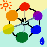
each color has its own cultural perception of 'vibes'. it varies sometimes, but overall tends to stay the same in different regions.
some general notes:
- red is for passion, vibrancy, love, anger, aggression, violence.
- orange is for the home, warmth, nostalgia.
- yellow is for caution, for life, irritation, sickness, sunlight.
- green is for life, plants, luck, overgrowth, envy.
- blue is for depths, ocean and sky, sadness, melancholy, a vastness, heaviness, calmness, trust, peace.
- purple is for royalty, power, luxury, creativity, dreams, sophistication.
- gray is for sadness, dullness, a bitter nostalgia, a down-swing.
the vibrancy and value (the lightness/darkness) of a color also does things to its vibe. a duller color will give a more morose or reserved feeling, while a vibrant color will be more energetic and pop-y. a darker color can be intimidating or a gentle warmth, depending.
color is probably the biggest and hardest factor to master. don't get discouraged! remember to play with it a little.
space
'positive' space refers to the area the subject takes up, and 'negative' space refers to the rest of the piece. there is also 'open' space and 'closed' space, which are more applicable to 3d pieces.
an easy way to exemplify negative space is to draw a little creature in an empty piece of paper. it's impactful, right? it's all alone. it's solitary. etc.
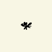
like that!
texture
the tactile sense! even digital art can have texture. imagine a surface with grooves and bumps and all that.
i personally keep a small repository of things i personally scanned onto my computer - scraps of paper, canvases, etc - that i use as an overlay in small amounts. more texture can make a piece feel too busy, though.
compare: texture made with words, and texture made with brush strokes. 'texture' can refer to more than just the physical surface. it can also define the business (and not the corporation kind!) of a piece.
value
imagine the color black. then gray. then white. that'd be three different values. it's how bright it looks at a glance, essentially. you might also know it as "luminosity" from your hue-saturation-luminosity sliders in art programs.
values are often used to divide fore, mid, and background, and the bigger the contrast between, the more depth it gives. this is my thumbnail process for the critter.cafe banner i recently posted:
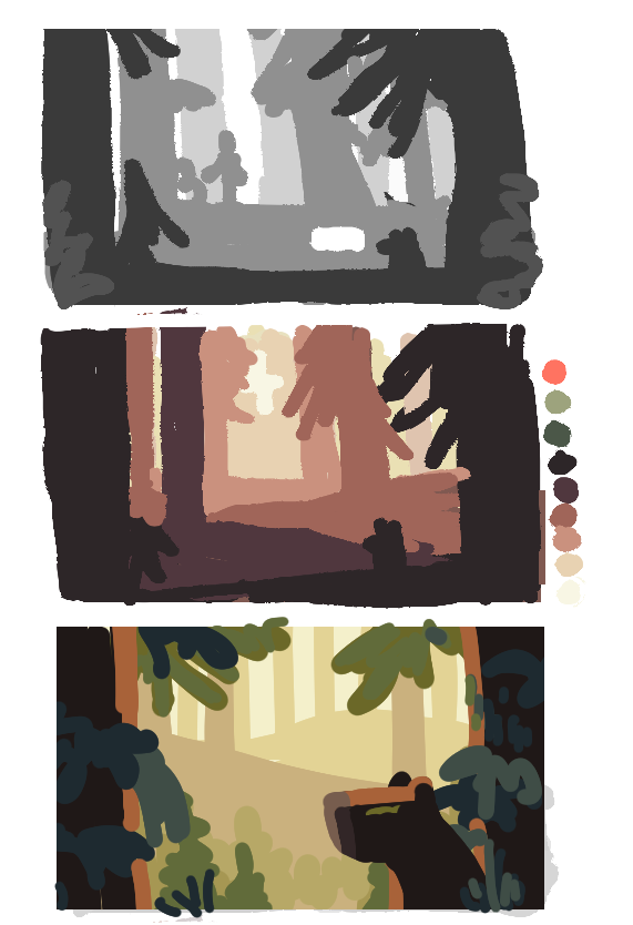
a thumbnail is basically a very tiny sketch for you to solidify details before you commit to a larger canvas. here, i started with a value layout. things in the background are light, and get darker as we enter the foreground. you can do the opposite, too, of course, where the background is dark and the foreground is light.
i often struggle with "value spread" - the contrast in a given piece - and that's where value thumbnails come in handy. in addition to depth, they also give clarity of form, and make a piece easier to visually parse and comprehend.
in conclusion
balancing each of these can be really hard, and honestly, my best advice is to focus on one or two things you really want to work on and go from there. and hopefully this will help you take apart some of your inspirations for ideas.
for futher reading, design principles can be considered another level of art elements. they're more specific about application rather than the elements themselves.
 >> swifty's hq v2.2 > main > blog