deconstructing the dogthingwalker
the first step in making something is figuring out what the hell you want to make, and how you want to set it up...
i'll be honest, it actually occurred to me midway through the entire process that i could have foregone the 3d screen effect and just done it on the texture, instead of modeling in all the buttons. but that's lazy and not as fun for me. and if i can't have fun with the process, it might as well not be done at all. haha
so first i got the basic shape set up. i started with a squashed circle with an inset rounded rectangle, fitted approximately to a photo reference for accuracy.
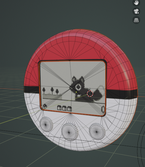
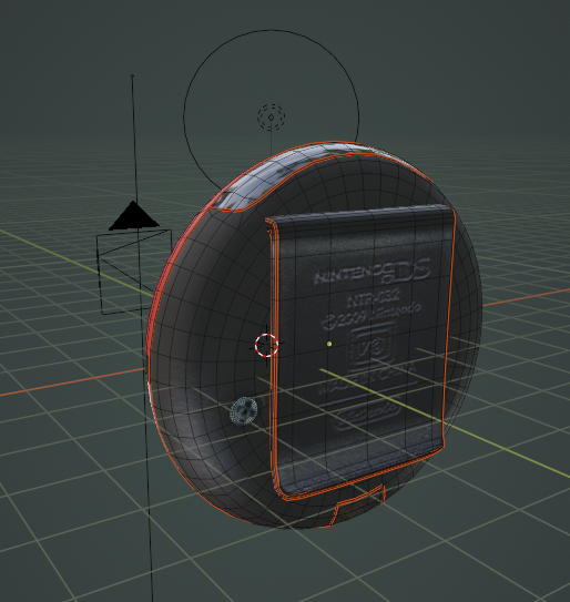
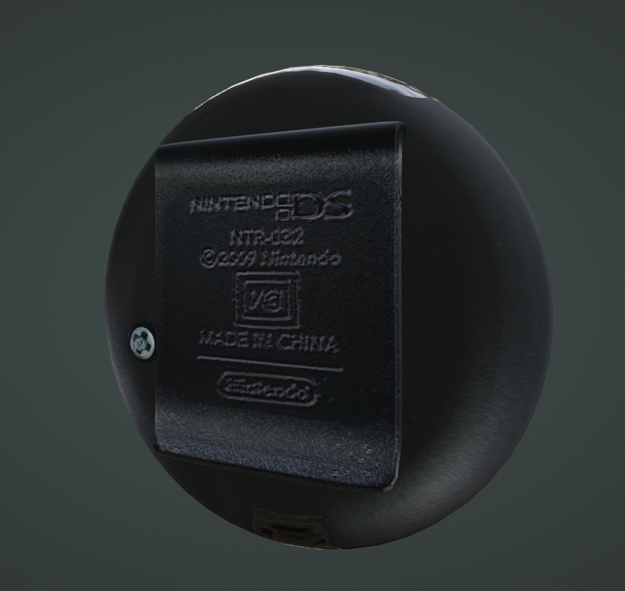
pictured here: the front and back of the final product. the buttons are free-floating and do not connect to the base mesh, as is the back clip and screw.
the texture was then externally edited together in clip studio paint and i appended the pixeled bits i had drawn in aseprite. i used some normal maps to add a slight depth to parts of the copyright disclaimer on the back; i tried it on the buttons but it looked strange, so i scrapped it.
for the screen, i tried to emulate a real LCD. it has three layers: the glass, the pixel inlay, and the background. the background cel has its own shader that adds a slight noise filter to emulate the sort of glittery feel it has on a real pokewalker. (i was always enamored by it, anyway.)
my first pass at the glass was fun for visualization and practice, but i ended up going with something more friendly to cycles rendering:

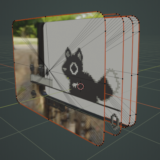
i had to edit the cycles rendering options a little, since i was using glass overlay AND an intentionally noisy lcd backing and it was causing some fireflies (there are tons of ways to fix these rendering 'bugs'!). but overall the effect seems to hold up pretty well, even at an angle:
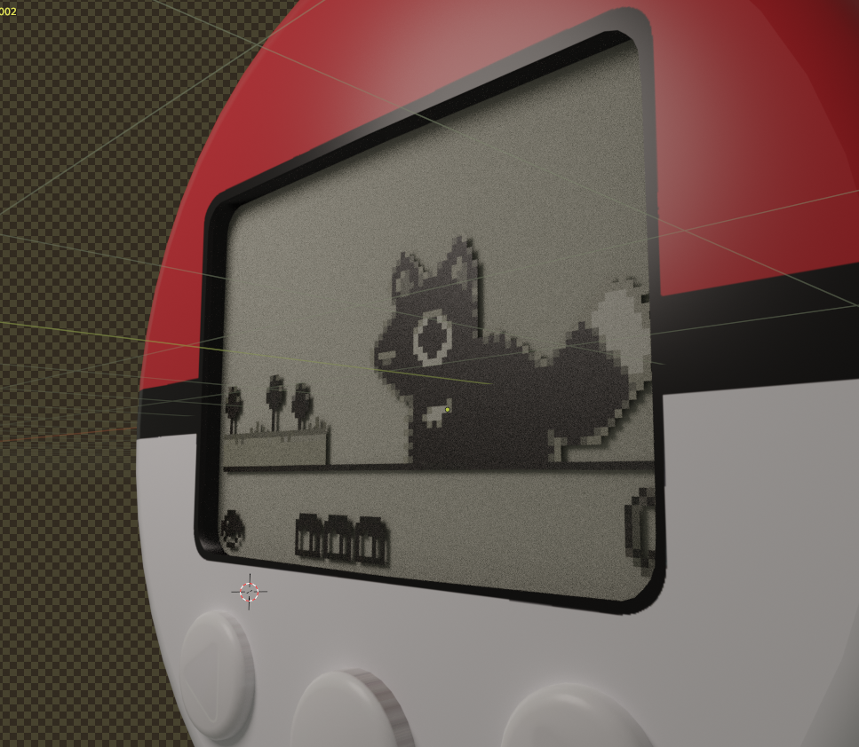
the thing about this type of display - featured in lots of similar toys, like tamagotchi screens, or gigapets, even - is that the pixels lay on top and cause a drop shadow, which causes the pixel to look softer. it was kind of hard for me to get the right distance between the layers for that effect, but i think i managed well enough.
i used a tool called 'AnimAll' to animate the uvs moving, and then set the interpolation to constant, so it wasn't tweening between the two states. i will be honest it's hard as hell to align the uvs identically; i had to do a lot of adjusting and re-rendered the final piece once or twice to fix slight offsets.
also you have nooo idea how hard it is to find a good high-resolution image of the copyright info on the back of the clip. i did end up finding one, but jeez!
figuring out the dimensions of the lcd screen was a bit of an enigma. i ended on 100x68, i think it was, using a pokewalker emulator video as a size reference overall. (the bulbapedia entry for the pokewalker defines a 128x64 screen, but i doubt that, somehow...)
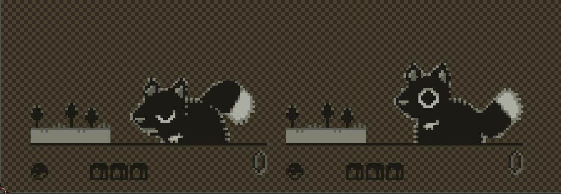

the pixels are scaled up to around 4x the size, i think it was, then the texture was set to 'closest' accuracy to remove the fuzzy artifacting between pixels.
in hindsight, i did make two errors with the model: the IR port on top is incorrectly shaped, and the place where the screw goes on the back should have a little divet to the edge. i made the latter error because i kept looking at backsides without the clip. ah well!
if you want to poke around this project, it is a blender 3.6 file, and you can download it for personal use only here (until i delete it from my drive at some point in the future). if you use it for something, please credit me with a link back to this site, and please don't go selling iterations of it.
thanks for reading!
 |
| listening to: ya boy kongming! opening |
| playing: webfishing |
| feeling: contemplative |
outside it is:  sunny sunny |
 >> swifty's hq v2.2 > main > blog