 >> swifty's hq v2.2 > main > blog
How I Trained My Sense of Color
perceived vs. actual color
some years ago, i attended art classes in college. there were lots of very useful lessons taught there, but one of the most important to me were the ones relating to perception of the subject.
if i asked you what color this was, what would you say? it's like, a dull cream or yellow-green,, right?
well, let's put this color in context:
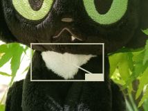
it's actually the white patch of fur at the base of toby's neck. the reason it's green is because of the surrounding light and color space, which is predominantly a warm green:
this is what we call 'perceptual color' - the color the white turns when it's in a colored environment. which means that 'actual color' is the basic color that it "actually" is, white.
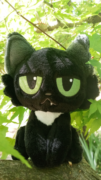
it's easiest to see this with subjects that are grayscale, especially white. this makes toby a pretty good example. here's another image, with the light and dark shades of each color sampled.
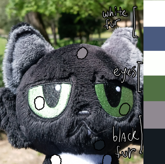
i dabbed the colors in approximately the same location i picked from. here you can see that, despite the eyes being the same "actual" color, the light is hitting one more directly, making it almost white in this photo, while the other feels "closer" to its "actual" color.
you can pretty easily see the difference between the colors. the reason they look so different is due to the influence of the light, both from the sun and from the ambient source (the sky). this is called available light in other contexts, but 'ambient light' is what you are more likely to hear from artists and similar.
the sun color here is mostly white with a tinge of yellow, while the ambient color is something more blue. this is why the lighter colors are "warmer" - that is, closer to yellow than blue on the color wheel - while the darker colors skew towards "cooler" hues, closer to blue than yellow.
you will probably hear a lot about color temperature in art lessons, and in this blog post. it seems difficult to describe what makes a color more warm or more cool, or it may feel kind of complex, but i conceptualize it like how i said it before: is it closer to red/orange/yellow, or green/blue/purple?
some examples
well, with so many options, how do you pick the right color for an object in a given setting? i'll be borrowing from unsplash for my examples here.
say i want to draw a white dogthing in the woods. right? (image source.)
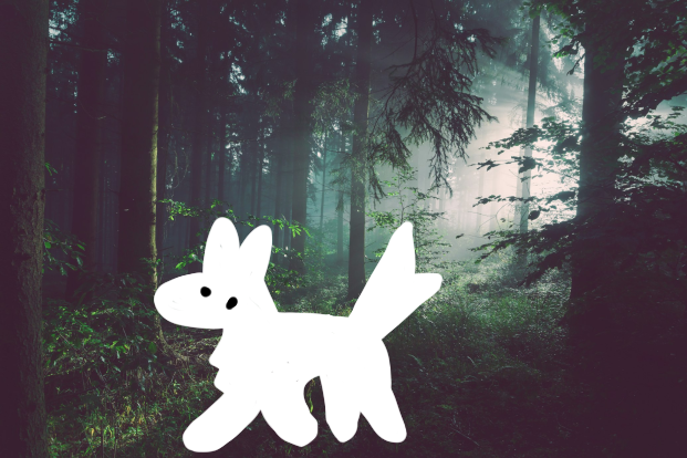
in pieces like this where there's a nice fog effect around the light source, you can kind of colorpick around it for a color that might best represent the 'ambient light'. white dogthing is great for this, because white is just a great color for reflecting environment light.
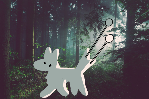
i added a rim light for flair, using the lightest white value i could find in this piece. already this dog looks more 'grounded' in the piece (aside from being overlaid on top of all the shrubbery!).
now let's put this dog in a situation: in a nice sunset mountain lake.
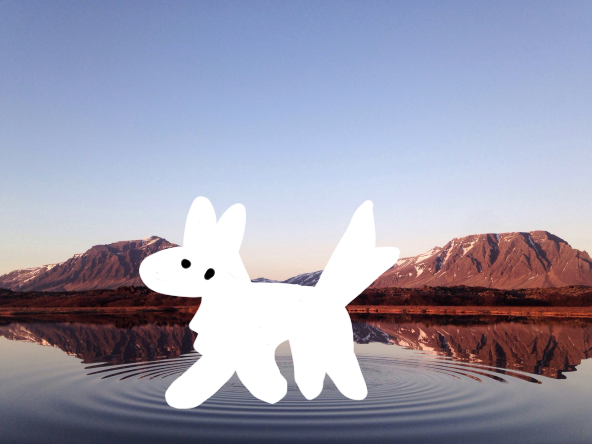
wow, it walks on water...! wait, nevermind that!! this dog feels totally unfitting for the scenery. so let's fix that.
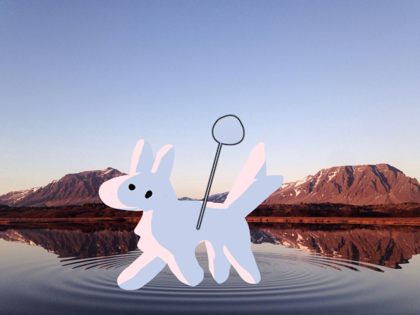
phew! now it looks a bit more normal, but it's still floating...!
anyway, i color sampled from the sky again and gave the highlights a pale orange-red, since the sun is setting and probably looks more reddish than if it were afternoon-time.
hmm, let's try something that isn't a white dogthing. something more ambitious.... forest!!!!!
let's put forest in a few different-colored environments, shall we?
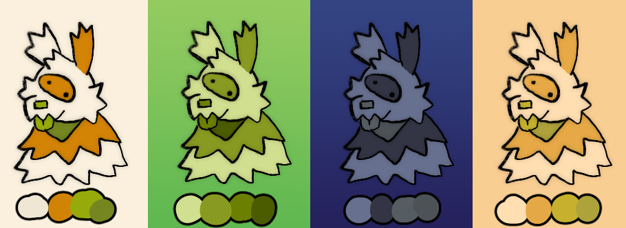
you can see here that the "perceptual" colors vary really wildly, but you can still get the impression that the "actual" colors are the same! you are perceiving different colors than the "actual" ones, and those "perceived" colors are the ones to use when painting the subject later...
color picking intuitively
some important notes on adjusting color to environment:
- putting colors into a setting that is the opposite color (complementary, like redg/reen, orange/blue, or purple/yellow) often desaturates them. the blue forest here is desaturated and closer to purple, but still clearly some kind of warm color.
- putting them in a setting of the same color doesn't change them all that much
- putting them in a setting that's adjacent to the same color causes them to shift slightly towards the new hue, but not too hard
- more saturated environment often means more saturated colors, and vice versa. same goes for dark and light settings making colors darker or lighter.
now, how do you figure out what colors to pick for each setting, anyway? well, my usual strategy involves moving the color towards its environment color on the color wheel, usually whichever direction it's 'closest' from, and then i either darken, lighten, saturate, or desaturate. like i said above, if the colors are opposites, i will desaturate and darken the new color.
i hope this helps anyone struggling with color choice!