>> swifty's hq v2.2 > main > blog
trailhead: from start to finish
thumbnailing
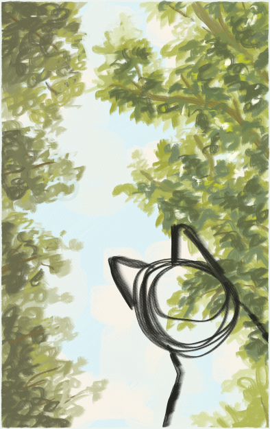
i started out with a little rough draft to plot out the overall idea and the values i wanted. if i were a little more proactive, i would have done a color draft, too, but i ended up just winging it from a reference (photo i took).
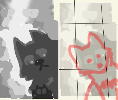
after the blockout, i refined the head shape for toby, since i wanted to make sure i could get it looking foxlike enough. i still felt pretty uncertain at this point! i also roughed out thirds to try and focus on one of the corners of the inner square. i knew i wanted toby peeking from the bottom right, but not where exactly in the bottom right.
background
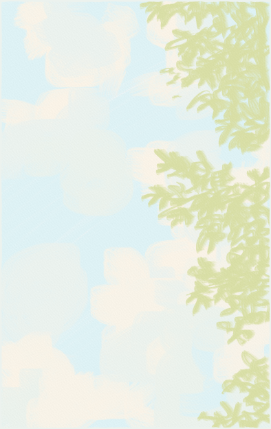
i tried something a little different... i decided to start with the sky and work my way down, which i think works well and i'd like to do it more in the future. i colored in the sky and then roughed out the walnut tree leaves on the right.
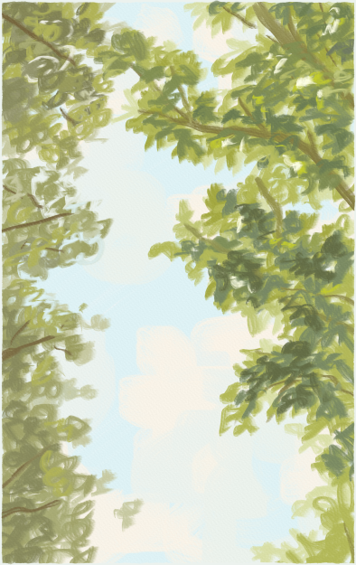
i added the pine trees on the left and added some of the closer leaves and branches on the right. i find myself struggling with value depth and color choice, but i think the pale tones here were just fine. i tend to end up color-correcting my pieces slightly by the end, and i expected that here too.
toby
i roughed out where toby's head and upper body would be here. at this stage, i thought i drew it the right size, but i found myself wishing i'd made him a little bigger in the end.
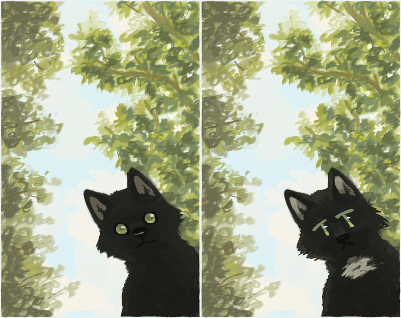
at first i went for a more round animalistic eye, but then found myself leaning towards something more toony and unrealistic. i also added the white neck ruff here; have you ever studied a cat's fur? i have been doing that a lot lately. it's been interesting noticing that fur tends to pile in certain ways - out, rather than against the neck sometimes.
refinement

i continued to refine the background and subject to add darker values. i added closer foliage and tried to make his muzzle more distinct.
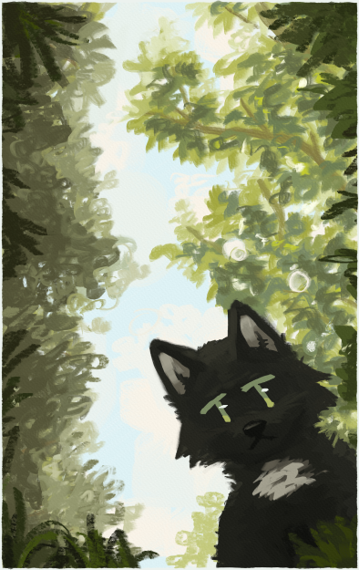
more leaf refinement, especially for the pine trees. i think the left side got muddied a little but i tried to fix it here. i also refined the cheek fluff on toby.

i finally got around to editing the color here, since i had most of the values in a place i was fine with. i always find myself overdoing it with filters, so i've been trying harder to not add drastic change if it doesn't add color unity to the piece.
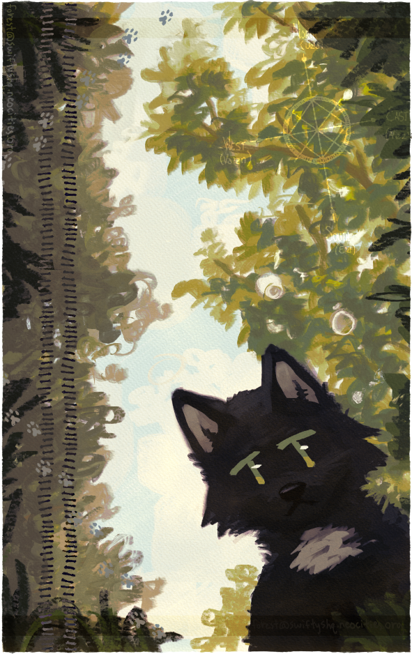
from here i added the symbols on top, and viola! the finished piece.