My 2024 Art Retrospective
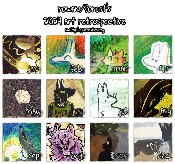
i drew more than i thought i did this year! and i am really proud of a lot of the different pieces i managed to make. i'm really excited to get to tell you about them & go more in-depth on some of the processes i used.
full disclaimer that not all of these are on the site (due to either space, time, or apathy about putting it up online). i'll still post smaller versions of them here, so if you're subscribed to the blog rss, you get some secret arts... 👀
january
this piece is called chrysalis. i believe i made this because i was motivated to draw something a little weirder, a little symbolic, and a little suggestive, i think. i had a very strong mental image of a dogthing entubed and corded into something. i wanted to lean into more baroque textured shading with liberal use of warm yellow tones.
i, as always, really enjoy drawing loose wires as background decoration. i can't remember what my motivation behind the squiggles was; i would assume to fill some of the empty space and add to some feeling of energy pulsating or transferring somewhere. movement. as much as the subject is static, i also hope it comes across as a breathing thing, resting, recovering. i think that was how i felt at the beginning of the year especially.
i still think my favorite part here is the way i shaded the central tube. really adore that i let it fade into an opaque yellow near the chest.
february
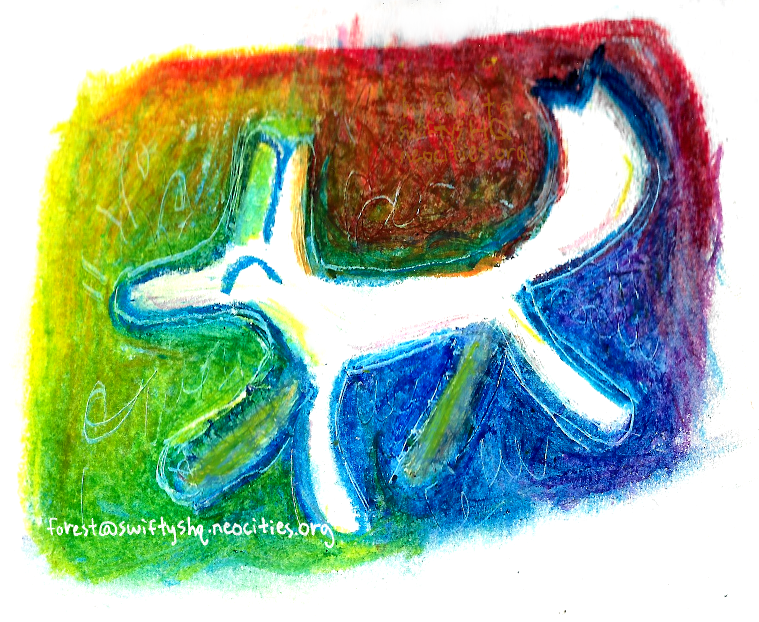
this piece is called chroma. it was my second or third doodle in a series, an attempt at understanding how to blend oil pastels after not touching it or really using the medium at all previously. i found myself fond of the messy, childlike roughness i found myself emulating. it's kind of grown-up crayons. i got a better scan of this drawing recently (as this was just edited from a photo i took of it).
march
further foray into traditional mediums, this was titled nature in perspective. i was very much torn on whether to pick this one or forward, but i am a little biased towards swifty, sooo....
layering colored pencils is as much of an enigma as it ever was. it's scary to put down dark colors, but if you layer over light colors they tend to stay lighter, even if you're pressing hard on the paper with a black colored pencil. ahh!!! it was interesting to experiment with them though. i would like to do more with them.
april
this piece is titled life is green, and is representative of my outlook as a whole in the past few years.
it's really like this when you're a shut-in loser for most of your life. but now i'm a shut-in swagbeast. totally normal thing to call myself! haha
the background of this was done with oil pastel. it lacks some value depth, but i don't mind so much. i went over it with some colored pencil in the clouds and grass. i then drew that dogthing on another paper with colored pencil and cut it out. same with the text. it was a nice way to convey this sense of hesitant quasi-detachment from the real world, scarily close to breaking through.
i would like to focus more on that transitional space between reality and brainspace in further works!
may
this one's called compass rose, a photograph of a physical cut-out drawing.
i actually started going out of my house a little. not like, far. i went out into my front yard, which my dad, as a former landscaper, has taken very good care of over the years despite both of our ailing physical health. i still get nervous about being outside, even in such a rural area. i've gotten better over the last few years, since i've been going out to see my girlfriend in the neighboring state of oregon.
that said, i did feel a little silly going out there just to take little photos of something like that. maybe i'm just overly concerned with the opinions of passerby still. but i'll just have to keep doing it until it feels more normal and less scary.
i'd like to do more cutout stuff in the future. it's nice to incorporate real-world objects, as it helps push that "transitional space" thing i mentioned above.
june
this one's humble gardener, which had a maybe surprising amount of post-processing to fix some errors in the initial draft. here's how it looked before edits:
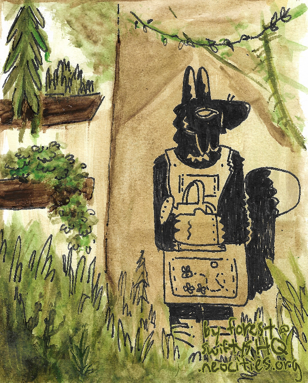
i ended up redrawing the eye entirely and coloring in toby's clothing and watering pail digitally, which i don't regret, honestly. i planned a little around it. usually i am really loathe to edit heavily like that but it's sort of necessary when you're trying to plan out what is actually feasible in the original draft.
i liked turning this into a winamp skin for myself later. i still like it a lot as a whole too. i'd like to learn how to paint greenery a little better with watercolor.
july
a looooot of stuff in july but almost all of it is for other people. i ended up choosing quiet hands, as it was one of the few pieces of personal art that i drew that month and i still find it rather interesting from the development point of view.
during this month i scanned some old school reports. they make for nice texture in addition to having significance on a wider scale. i had a lot of school troubles, as i've been sure to mention in the past! lots of 'pleasure to have in class' and almost no 'followed directions' feedback. i mean, the report i used here even has "parent conference" in the first trimester review section...
this is another one of those examples of upcycling that i've been fond of lately. it's nice to be able to make something from what you have on hand, whether they were initially intended to fit together or not. this image comprises of three parts: a watercolor brush stroke, a dogthing doodle, and the report card. it kind of feels symbolic to be reincorporating bits of my past into something new with a fresh, strong message.
august
i was mostly burnt out from art fight, as it tends to go. i drew this piece, informally titled "in jest". i don't know that it has much deeper meaning intended, just generic toby doodle with gratuitous green and reddish tones and textured brush / rake brush usage.
september
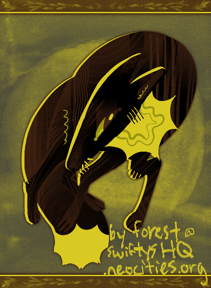
i felt like my wish was mostly an experiment in color blending, but also represents that sort of survival mindset, keeping the inner self safe as we hurtle forward in time. i enjoyed working on the color blending but it did hurt my wrist a lot LOL.
i've had this general pose in mind for a while. i sketched it out at least four or five times on different pieces of paper, either as marginalia or the full subject. i wonder if this would have looked nicer in watercolor. ah well!
october
reminding myself how to draw. exhibition is another toby piece. it's really interesting to think that toby was properly identified and named earlier in the year, and then continued to be a recurring subject for me to draw. maybe i'm vain. so sue me!
i enjoyed doing this angle. i don't often draw front facing foxes; the idea kind of intimidates me, because it looks so weird. but this turned out OK. i liked the red rope as a motif here, a wild animal ostensibly being kept restrained but quite easily able to break free. it kind of reminds me of the elephant allegory, being scarcely restrained by a weak tether while being afraid to actually leave, but i dunno how much it applies here.
november
i tried rebelle 5 more and i liked it a lot. i drew a lot, but i ended up picking pinyon as my favorite for its personal historical significance. this is based off of a street view of a place near where i used to LARP warrior cats with my friend and my sister.
it was weird looking at that neighborhood from street view online. i'd almost completely forgotten the way to that friend's house, but managed to find it, more or less. it has a lot of plant life stereotypical of the overlapping conifer and oak woodland biomes present in northern california.
this kind of conifer has confounded me for a long time because it's kind of an ugly pine tree. like, the average person who knows about pine trees will think it's like a christmas tree, but these trees are a lot less hallmark-type and a lot more durable and built to survive some droughts. their branches are drier and sparser than their cousins.
i imagine the one pictured here must be a hardy digger pine (as my dad refers to them). they are referred to this way because of the way their cones will 'dig' into things. they're frequently a hazard for cars traveling underneath (they can crack windshields!) and may do some significant damage when driven over.
anyways, i've never known how best to draw their branches. i figure light, airy, textured, curved brush strokes are the way to go. they seem to convey the naked pine branch foliage look.
december
gosh. so much has happened this year. i had trouble drawing this month, but with a new tablet stand given to me by my good friend autumn rain, i was able to make a few things with less physical pain. yippee!
it was a hard pick. i ended up picking my stop. this is another piece painted from google street view reference. i'm getting a little better at eyeballing color, but not nearly enough, so referencing real photos has been helpful. i kind of wish i'd gotten more texture onto the oak leaves in the tree in focus here.
i will say, it was really nostalgic looking at the street view. i used to stand here waiting for the bus, or getting dropped off there. the pallet there had been there since before my time, weathered and worn. it felt very lonely as a setting, liminal, and even driving by it now makes me feel a little melancholy.
despite being put there to keep kids dry (where water would just flow down the shallow gutter), only one or maybe two kids could stand there at one time. it was viewed as a little bit of a luxury.
in retrospect, i kind of wish there was proper seating. but i find myself thinking this about any place i've been for extended periods of time. haha
in summary
this was a year full of a lot of formative artistic decisions. i've been reframing a lot of my thought processes and basic views. re-assessing how i react to things and how to assess risk in a healthy, appropriate way has really allowed me to flourish. this sort of also applies to the ways i've accommodated my own health when drawing things. the new tablet stand has been nothing but a benefit for me. the old stand was so small and unstable i had to overcompensate and strain my arms.
i learned a lot of new techniques and i had fun experimenting with new mediums. i don't regret a single piece. i think that i've improved a lot in a lot of areas, including color and texture. it's crazy how much texture can affect the feel of a piece. our brains are wired for sensory input, after all. although it's primarily visual, you can convey a lot of tactile feedback with a little grain or brush stroke use.
i would like to improve in anatomy and thumbnailing in this next year. it's hard to commit to a piece if i don't have a gameplan, and i'm pretty impulsive in what i decide to put effort in. i'd also like to focus further on accommodating my chronic pain and exhaustion, and continue exploring traditional mediums and seeing how better to mix them.
thank you for following me through the year, whether you started reading recently or have been around a while. i hope you can also find things you did well in your own artwork. stay gentle with yourself this coming 2025!
 |
| listening to: shrlok - told you |
| playing: dandy's world |
| feeling: achey |
outside it is:  sunny sunny |
 >> swifty's hq v2.2 > main > blog