 >> swifty's hq v2.2 > main > blog
Website Layouts: The Secret Of Flexbox
it can be really intimidating to try and create a website. it's even harder when you have to think about how it should look, what to put on it, and how the hell you're going to make it look properly formatted. luckily, i'm here to help!
you will want to start either by opening a note-taking document or by grabbing a pencil and paper. write down what elements you want on your website. a banner, navigation, content section, and footer are pretty standard, but you can mix and match as you'd like. for this example website, i think i'll write down that i want to have a navigation bar, content, and footer.
this isn't "everything" you want on your site, but it's a good skeleton for what you will be using to display what you will host on your site.
you may want to take some time now to think how you'd like to display it. will the navigation be horizontal or vertical? do you want some space between it and the actual content? do you want it to have dropdown menus, or will they be simple text links? et cetera.
now, grab your scrappy drawing program or pencil-and-paper and draw this layout as though you were packing one larger box with smaller boxes - a box for each element you want, so in this case, the navigation, the content, and the footer. if you have colored pencils or similar colored media on hand, it will help to color-code what each box is so you can better visualize it.
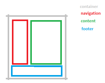
some foresight here: flexbox, which we'll be using for the elements here, has two directions it likes to display its elements in. it either wants to display them in a row or in a column. so you may want to divide your content into more groups, potentially, like so:
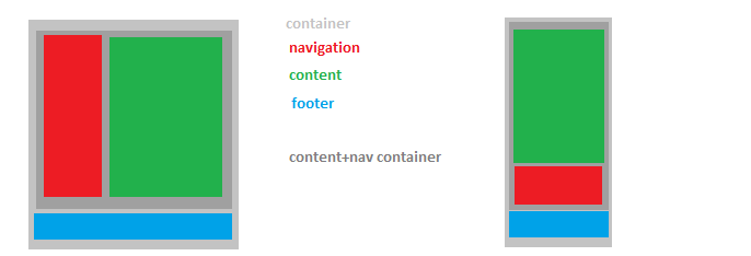
then you can rearrange these in a taller, longer box - this will be how you'll sort them in mobile view. don't worry about how, yet. we'll get there. remember, we're just concepting still! in the mobile view, it's best practice to have content first (usually with a 'skip to navigation' option on the top somewhere), followed by navigation, and then followed by the footer, because when you open a new page, it will get annoying to scroll past a lengthy navigation section every time.
now, we can get started with creating the loose code outline for the site. you may want to familiarize yourself with html syntax and elements if you aren't already familiar: w3schools is pretty accessible. even then, you should pick it up pretty intuitively in multiple respects - and if something breaks, just check for misspellings or neglected angled brackets.
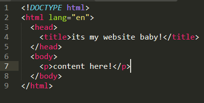
here's how a basic page is set up:
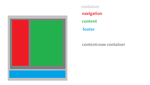
and here we have the different groups of elements set up. i have outlined them in the colors from earlier, and i also added something called semantic elements that serve a dual purpose: it allows screen readers to parse information properly, and it allows you to get a better idea of what each div contains at a glance of the code!
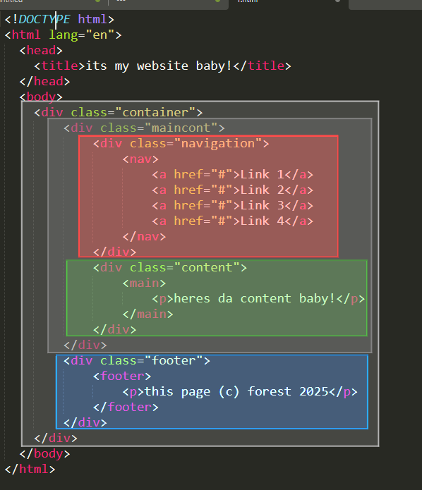
i even color coded it for you! here's the live preview.
now we can get started on the coooode! you'll want a .css file, and then you'll want to make sure to link it in the head tags, like so...
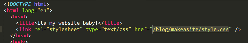
you will want to replace the highlighted path and filename to the place (and filename) that's applicable for you.
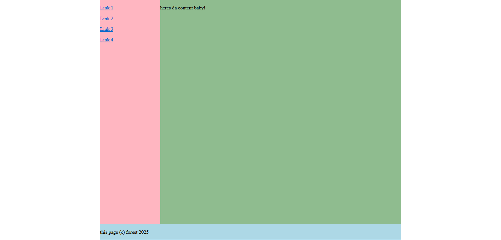
and with a bit of time, i get the code structure ready. here's the pure css for you to modify and poke at, and here's how it displays in a live setting.
...and here's documentation for what each part does (because knowing how your code works means you can diagnose and fix issues later):
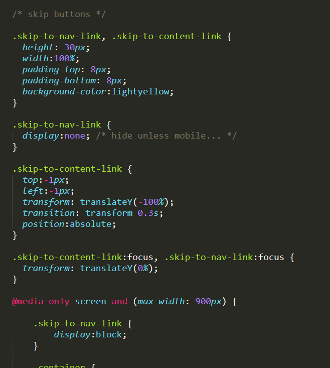
the margin:0 and padding:0 settings allow the nested elements to reside within each other without adding in spacing around or inside them. it helps with alignment!
the .container class has a width of 60% of the 'viewport' (the browser window), but also has a 'min-width' to clamp down how small it can actually get when resized.
.container has the margin value "0 auto", which means the browser will decide how much padding to add based on the width. it's often used to center things, like how it does here!
flex related details:
.container is a 'flex' element, which displays the .maincont(ainer) and footer in column sort (one atop the other vertically). it uses 'align-item:stretch' to make it span the entire screen.
.maincont(ainer) is also a 'flex' element, as it holds the navigation and main content and displays them in a row (side by side).
using 'flex:#' tells the element how much it should stretch out compared to other elements in the same container. for example, .navigation is flex:1 while .content is flex:4, meaning the content fills out 4 times as much as the navigation. it's proportional! (be sure to still define a min-width value.)
oh, but wait a minute! what about making this mobile friendly? i can hear you groaning, btw.
luckily, flexbox makes it, like, super easy to re-order elements. at the very end of your css, you will want to insert my bestest friend 'media-query'. this code tells the browser to execute this part if the listed element is true.
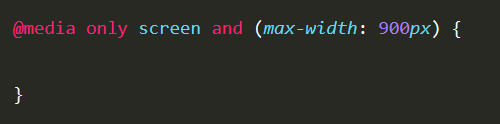
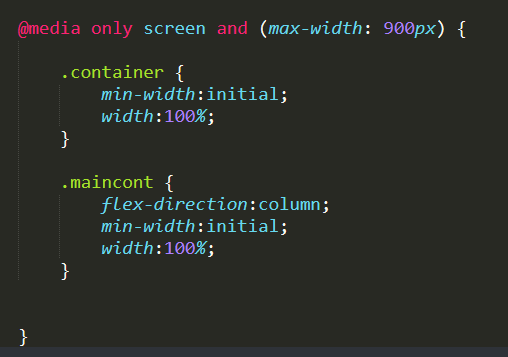
here, we have it trigger when the width is at 900px or below. so let's get cooking and nest some classes in here!
most importantly, let's change some of our flex containers to list their contents in 'column' order. we'll also set the containers to 'width:100%' and zero out the min-width values with 'initial', since, well, this is mobile and we want it to span the screen...
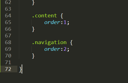
remember our sketch from earlier? we can reference that and add 'order' to each of the contents in a container to sort them that means we'll give the navigation 'order:2' and the content 'order:1'.
so here's how it looks now in mobile view:
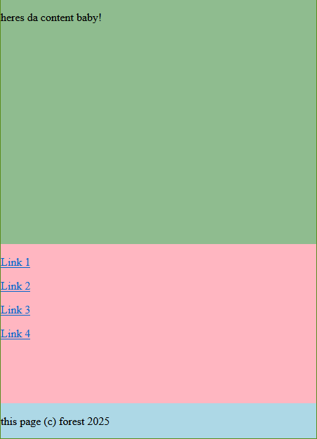
you should see no scrollbars here - if you see them, remember you need to write 'min-width:initial' and 'width:100%' in the elements in the media query section.
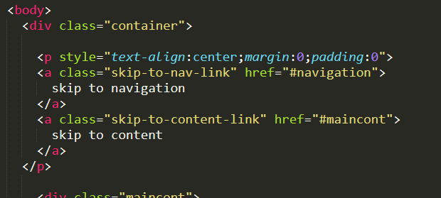
there's some modifications to be done here, like a 'skip to navigation' button, padding, scaling up the text (extremely helpful for clicking links on mobile), etc. the padding and size are pretty straightforward, but i'll walk you through adding a link to skip to navigation or content for screen reader AND mobile accessibility.
under your 'div class=container' declaration in your html file, add the following:
and in your css file, add this:
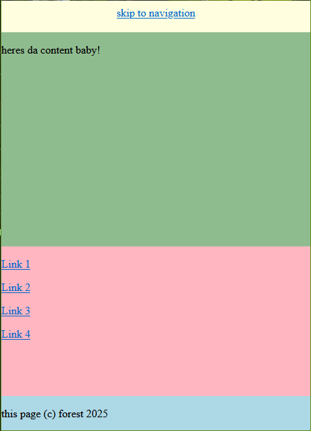
what this does is, on desktop view, if you refresh the page and press 'tab', the site will display a bar on the top that reads 'skip to content' that can be clicked to do just that! it's useful for people who use keyboard controls and a screen reader; this is not something that you may personally use, but it's vital for helping people enjoy your site.
on mobile view, this is visible by default, displaying a bar above everything that allows you to click 'skip to navigation' for those pages where you end up rambling for about 50 paragraphs.
i think that means... ohh! we're done!!
isn't that so cute? we did it! you can copy this, pick it apart like a turkey vulture, or frame it on your wall here, and you can see a live preview here.
and remember: a website doesn't start fully furnished! it grows over time like a plant! don't burn yourself out!