 >> swifty's hq v2.2 > free > wamp
the winamp skin reference
table of contents
foreward and comparison to modern
winamp has two skin formats: classic and modern. 'classic' is less modular and standard-sized, with all skins sharing the same dimensions, button format, and overall layout. 'modern' is more customizable, and you can move elements around at your discretion.
winamp classic has a leg-up on modern in a few aspects, most notably its ease of creation. since the layout is basically set in stone, the file structure is really just a bunch of loose files. there's no scripting required. you just need a good base idea, layout guides, and a dream. it's great for beginners who want to put their blorbos in their media player.
download and preparation
you can download the base skin from the winamp skin museum here or this handy template on winampheritage here if you don't have it already.
when you download it, it will be a .wsz file; this is just a renamed zip file, so you can switch the file extension to a .zip manually and extract it to its own directory.
set up your image
firstly, open up a new document in something like photoshop or clip studio paint. it should be 275px wide and 232px tall.
you will probably want to screenshot the default winamp player and paste it so it fits in the image. here, i have it for you...
on another layer, paste this - then you will be able to accurately crop the top and bottom graphics...
hide this new layer and paste in the image you want to use as your background. you can now crop the top and bottom and save them to your main.png (top) and eqmain (bottom) files. for the eqmain, don't overwrite the original file, but rather, copy and paste the bottom half of the template you had set up into the appropriate section like so...
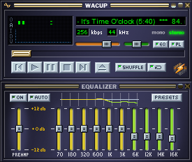
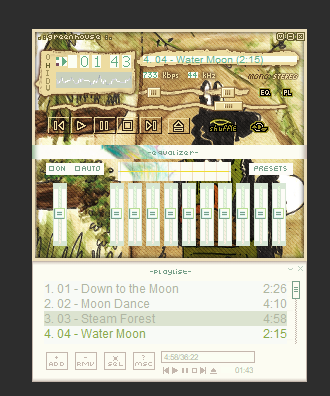
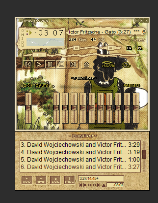
we'll get to the equalizer second. first, let's open up winamp/wacup and preview how the skin looks as-is.
as you can see...., well, first, youll see that i'm editing this off of another skin i made. but thats fine. the important part, though, is that you can see what needs skinned now, and from here you can actually take your screenshot here and paste it over your template document for alignment reference.
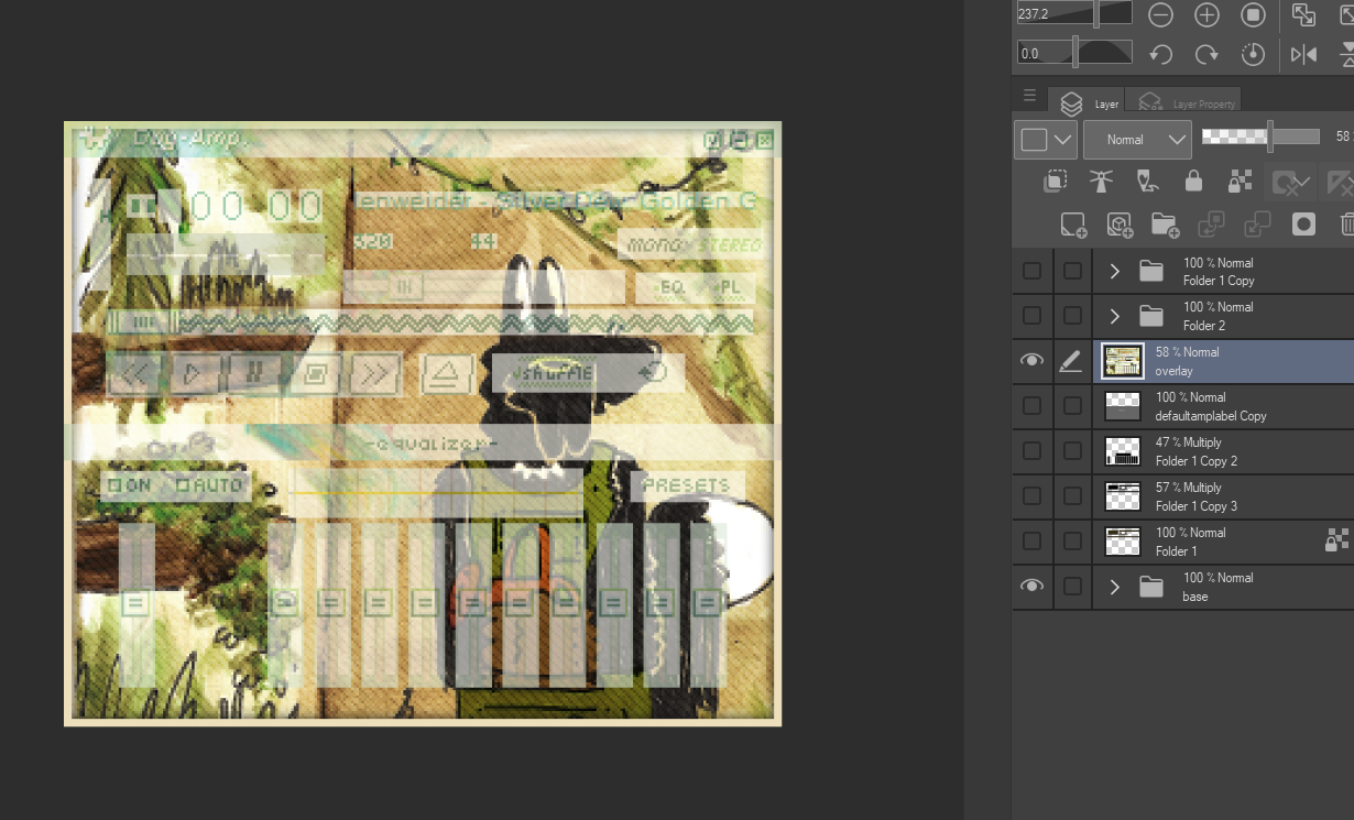
after i'm done setting up the layout and button text and similar elements, i start marking out what's going to need cut out / moved to separate files.
you're ready to start skinning!
cut it out
this is where i start designing some of the UI. i make sure it all is separated onto its own layers; my main.png gets changed a bit to add placeholder graphics that will show up if certain things aren't rendered on the player yet.
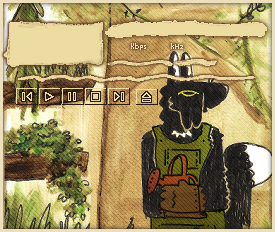
then, i start reskinning some buttons. generally what this entails is merging the image to one layer and then using the cutout reference to copy different regions over to other png files, such as the EQ/Main buttons, the player bar, and play/pause/etc buttons. as a rule of thumb, buttons are placed on the sheet in unplaced-placed order, or in the case of buttons like shuffle and repeat, they are in unpressed off/pressed off/unpressed on/pressed on order. if you don't know what that means, you can color the regions arbitrarily and see what they do on a live preview.
the titlebar image has (seemingly arbitrary) borders between some of the graphics. you can see them properly highlighted here.
the titlebar graphics are just the top 14px of your layout draft.
aaaand after a half hour or and hour of cutting and pasting... the top half is done! mostly!
as you can see, the text is still wrong, both its foreground and background colors. this will get fixed when we get to the genex.png file. for now, we're going to move on to the equalizer.
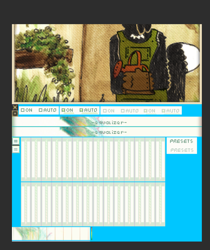
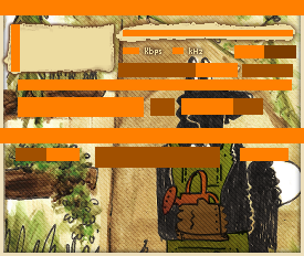
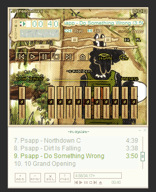
in preparation to skin the equalizer window, i'm also going to cut it up like how we cut up the main window. there is surprisingly less to cut for this; this is partially because the bars are not unique graphics. it iterates the same bar over and over. this is bothersome if you wanted to put a graphic under them, but what can you do?
another sadness is that neither the bars nor the dial can have transparent backgrounds. so they are blocky on purpose. haha!
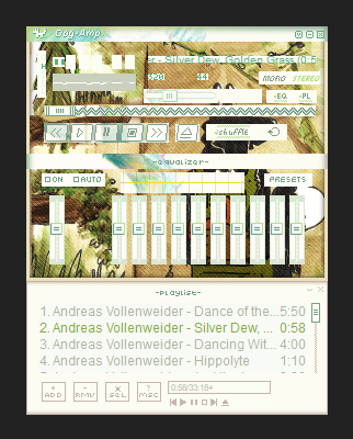
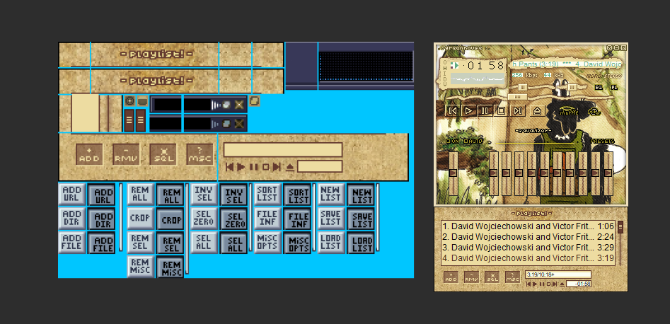
now the last part of the player we need to skin before we get to the extras (like text color etc): the playlist editor!
i am going to start by going to pledit.txt and editing the colors there. the labels are straightforward - text color, text color for 'now playing' titles, and then two bg colors.
after that detour you'll wanna open pledit.png. this one is also fairly straightforward. there are a bunch of buttons that i dont see at all - maybe just my use case? - but as another skinner once said: if you don't see it, it doesn't matter! LOL
as a beginner, you probably wanna try to keep the playlist section simple. you can make the buttons and titlebar look fancy, but the window itself is fairly simple in comparison to the other two sections.
now we tackle some odds and ends. playpaus.png and text.png will help recolor some of the remaining stuff on the miniplayer.
and the last thing for the miniplayer - viscolor.txt! this sets the colors you see in the visualizer. each code is an RGB value.
line 1 is the background.
line 2 is the dots that appear in the visualizer.
in addition to above, lines 2 through 17 act as the gradient colors for the spectrum view.
18 to 22 are for the oscilloscope view.
and, finally, line 23 sets one of the waveform levels.
you could do it by hand, but i find vis toolkit is an ancient and still reliable tool for classic skin making. i use it on more recent skins!
with that done, now we get to tackle...
gen.png and genex.png
first let's start with gen.png. as the title may or may not suggest, this is for general windows, such as the media library. the text boxes along the bottom are the font used to display window names, like "media library".
we have the top bar (active and unfocused), bottom bar, and left and right borders. it's fairly straightforward. you can do this one if you try!
next, we want to open genex.
the two boxes on the left are unpressed and pressed sprites for general buttons like library, play, enqueue, etc. the ones that are listed at the bottom of the media library! then there's some scrollbars, too.
the real hidden gem, the magic in the sauce, is the dots on the top right of the image. these color the context menu and media library. lots of people tend to leave this alone, but it really makes the entire theme pop when you have it edited to match your mini player!
the row of pixels on the right side of this image, from left to right, are as follows:

- ■ main window color
- ■ main text color
- ■ inner window color (stuff around search, artist, album list), context menu bg
- ■ button text color, context menu highlight, border color
- ■ inner window text ("search", "items" list, etc), context menu text
- ■ inner borders, highlighted context menu entry
- ■ selection colour for entries inside playlists (supposedly, but i dont see it)
- ■ category header background (artist, album, etc)
- ■ category header text color
- ■ category border color
- ■ category border color 2 (under text header)
- ■ category border color 3 (under the above one)
- ■ category header but like behind the column boxes
- ■ scrollbar color
- ■ scrollbar color 2 (they layer on top of each other)
- ■ pressed scrollbar color 1
- ■ pressed scrollbar color 2
- ■ bottom right of where two scrollbars intersect
- ■ active text (ie when clicked)
- ■ active text bg
- ■ current songtitle text color
- ■ current songtitle text bg color
- ■ alternate list bg color
- ■ alternate list text color
the end
and now you're done. you can now label your folder with the skin name, zip the folder, then change the extension to .wsz for easier transfer to other people. congratulations!