 >> swifty's hq v2.2 > misc > webtut
webpage tutorial
the makings of a retro webpage
introduction
so you want to make a webpage, and you want to emulate some of that old 'charm of the net' you see all over, right? that's great! i myself have done that for this very website (the one you are looking at Right Now!) and hopefully i can help you make some design choices that feel stylish and functional.
this can obviously feel like an insurmountable task if you don't have enough knowledge of html, but that's okay! i will try to go step by step into what i personally did in order to get that same feel, and simultaneously show you the coding elements i used to achieve it. let's go!
choosing a site style
in my experience, it's easiest to find a website from the time that has a look you REALLY like, and one that you feel you want to emulate parts of. (without stealing the entire code, of course...)
you may enjoy looking through archive.org's internet archive for this. there are a number of site types to look into - geocities is a goldmine, of course, alongside other things like fansites.
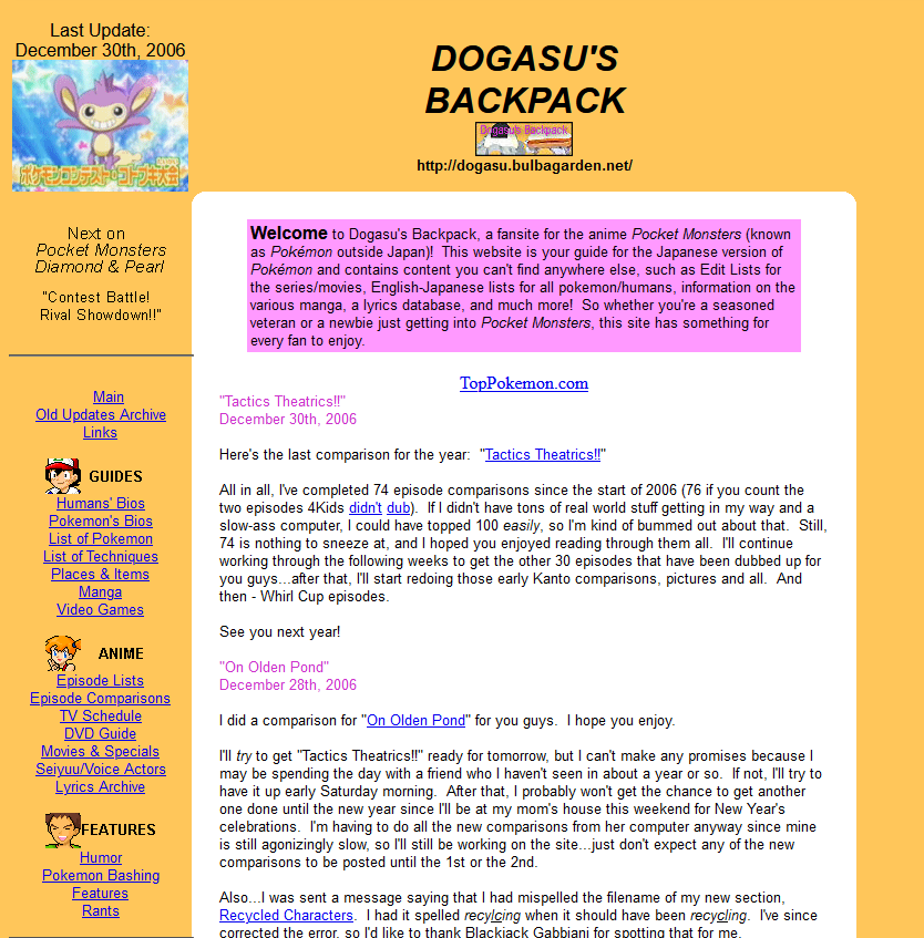
for this, i'm going to focus on one website: dogasu's backpack circa 2008.
extracting the elements
here's a screencap the webpage we will be scouring...
and here's my initial notes on the layout:
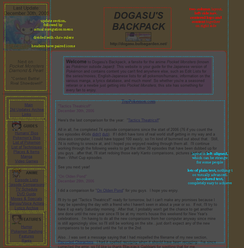
transcribed:
update section, followed by actual navigation menu. divided with hr rulers. headers have paired icons
two-column layout, left-side nav, centered logo and content together on the right column
layout itself is left-aligned (on the webpage itself), which can be strange (to read) for some people. lots of plain text, nothing t(oo) visually advanced, no colored text, completely easy to achieve
so there we go! easy enough. we like the layout. the next part is thinking of any changes you might want to make to this layout.
i think it'd be nice to have a background image, for example. i also think it'd be nice to center the webpage so theres a visual 'gutter' on either side. the banner section in the second column could be an actual visual banner instead of just text (with added alt text of course).
compromise & accessibility
so here's the thing: some things about that webpage aren't all great! this was in the days before accessibility options (or at least when they were less often used). the colors are very bright - good for some people, but not for others with photosensitivity etc - and the left-aligned layout looks strange on wider screens.
luckily, these are fairly easy to accommodate, and considering how simple the site is, it won't be hard to add and modify things to your liking.
the biggest things to add on, imo:
- larger font size, maybe different font
- alt text on images (adding 'alt=""' to your img tags does this) for screenreaders
- alternate style options for high-contrast layouts (some people need contrast, some people have to avoid it)
- adding the 'main' tag to your content helps screen readers
the gameplan
in the end, i've decided that i could achieve this with flexbox, which i *believe* is a more modern type of ui element. basically, you can use these to create flexible table-type layouts that can transform when the screen becomes a smaller size to accommodate for less screen space.
so, what i would do here is create a container element that contains two divs and lists them side by side. the code for this:
this gives us a very minimalistic layout with the sort of format we want! to explain the flex bits:
display:flex causes the container to act like a flexbox. flex-direction says how the divs in that will align (row means they will sit side by side horizontally). align-items:stretch means they will stretch to fill the box. adding margin:0 auto; makes the container centered on the page.
flex:1 and flex:4 describe how much space each div takes up proportionate to one another. higher number = bigger div compared to the others. i set a maximum width on the navigation since we really want to prioritize the content side.
i could continue on from here, but i think i've kind of exemplified what i mean by 'taking element ideas from an old site'. you can see the sort of things they did and add more or remove more as you want. feel free to even use parts of that code for your own site, if you want!
final words
even if they look cool, old sites can have their own layout problems, including eye-searing colors, overly flashy gifs, and small pixel fonts that make websites almost impossible to look at if you have something like photosensitivity or eyesight issues.
it's good to accommodate these users! and generally, like, even people without these complications will enjoy the changes too. there's something to say about moderation. content warnings are also very helpful.
but overall, just try to make a site that you like that isn't so over the top that it keeps some portion of the populace unabvle to look at it! that's just bad business.
i hope this has been helpful!